Nectar
Responsive Web Design product page redesign
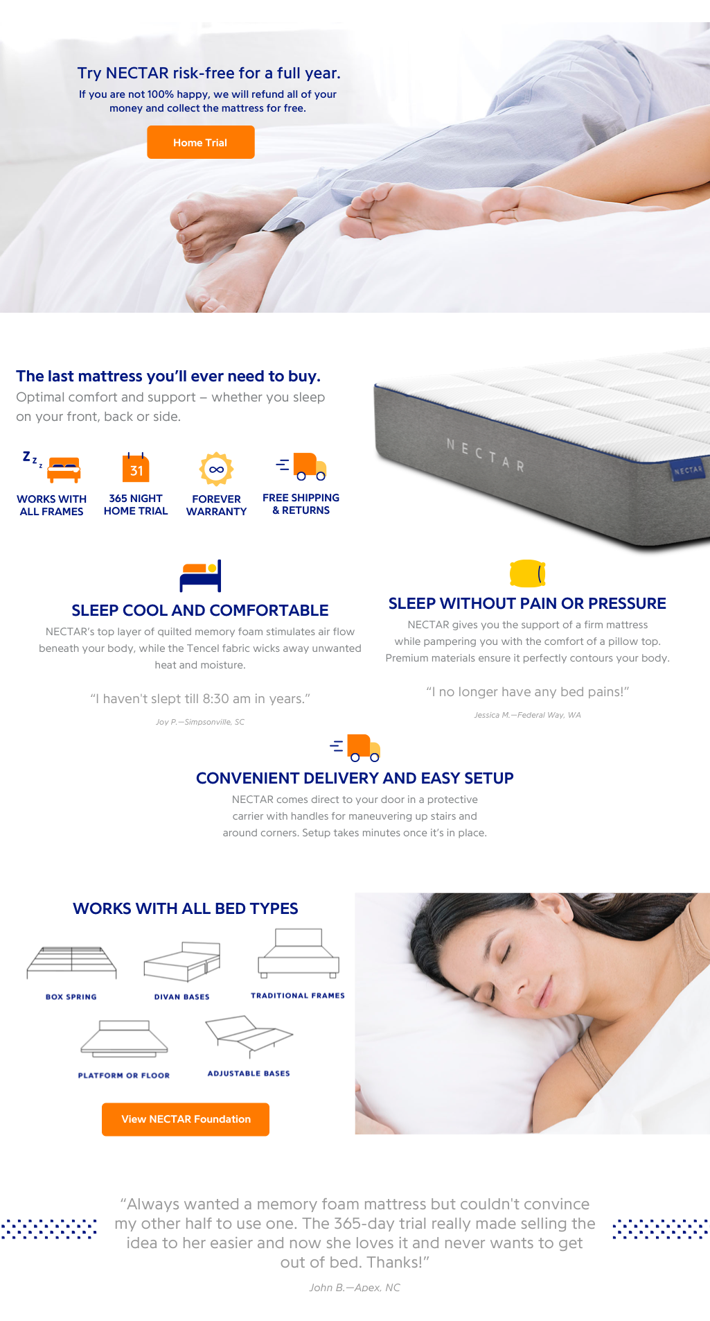
I was tasked with redesigning the mattress landing page for desktop and mobile platforms while staying true to brand style guidelines. I also incorporated a bundle opportunity for users to combine mattress, foundation and pillow purchases.

Nectar is a online mattress ecommerce responsive platform.
Discover & Research
To gather more information on an industry that I knew very little about but knew it was growing through online innovation, I conducted some market research through competitive and comparative analysis. This allowed me to find many common themes between these companies along with possible opportunities to take advantage of.
Along with the market research, I conducted a few user interviews to get retrieve more information on what certain users may want out of their online mattress shopping experience.


Analyze
After gathering all the information, I was able to conclude that users saw that price and delivery options were the most important part of their mattress buying experience. Users said that pricing should be more affordable considering that since they are buying from an online store, the “try and buy” option was very limited. Along with this, delivery options were very important considering that buying from an online company, removing and discarding their old mattress would be completely on the user. So having the new mattress be delivered in an easy and maneuverable way was seen as a boon when buying from an online mattress company.
Design
Utilizing the user information, I was able to take the already solidified foundation of the current website and added things to be able to make it more appealing and accessible to the user. For example, making the price and delivery options front and center allowed the user to see what they are getting and buying.
A major feature that they were missing was a floating add to cart bar/modal. Considering an online mattress company utilizes a lot of text and information to draw a user to purchase, that in turn lengthens the webpage. In the previous iteration, the user would have to either buy at the top of the page without scrolling for more information or scroll for more information and then proceed back to the top of the page to purchase. This was solved by having a floating “add to cart” bar/modal that would follow the user no matter where they are on the page. This allows the user to immediately purchase when they are “sold” without them having to scroll all the way back up to the top.
In the UX world, we worry a lot about excessive clicks but I feel we should also worry about excessive scrolling, which this feature solves.
Low Fidelity Sketches

Initial sketch showcasing webpage layout.

Adding a bit more information to the initial sketch.

Final sketch layout to then jump into Sketch for wireframing.
High Fidelity Wireframes - Desktop

Floating add to cart bar/modal


High Fidelity Wireframes - Mobile

Floating add to cart bar/modal


Deliver
This project was a simple redesign but allowed me to venture into an industry space I knew very little about. Along with the high fidelity wireframes for desktop and mobile, I also handed off a specification document that detailed all the information that was collected for this project.

